When it comes to the iPhone 16, iPhone 16 Plus, iPhone 16 Pro, and iPhone 16 Pro Max (or indeed any new iPhone), most Apple fans don’t expect to hear much about the design process outside of official Apple events.
It’s a pleasant surprise, then, to see that two Apple designers have spoken out about the motivations and design process behind one of the iPhone 16 family’s most interesting new features – the Camera Control.
With Apple Intelligence still not ready, the brand-new Camera Control is one of the few concrete reasons to upgrade to the iPhone 16. That may be why Apple senior product designer Rich Dinh and human interface designer Johnny Manzari chose to talk up the new button’s benefits on Cool Hunting magazine’s Design Tangents podcast.
The Camera Control concept
Dinh explained that the Camera Control exists to make capturing photos and videos easier: “We set off asking the question ‘how can we get closer to one of our visions in the camera experience?’ which is ‘never missing a moment’ […] I think the magic of Camera Control is that fast capture experience, getting us a little bit closer.”
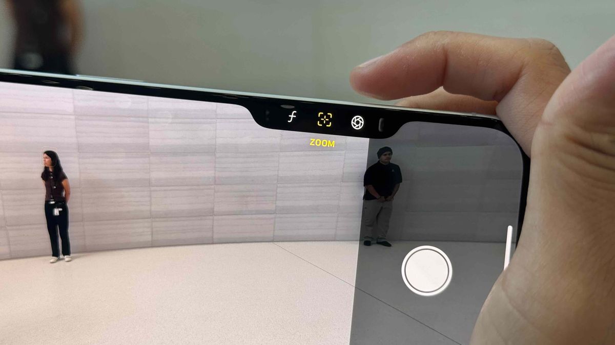
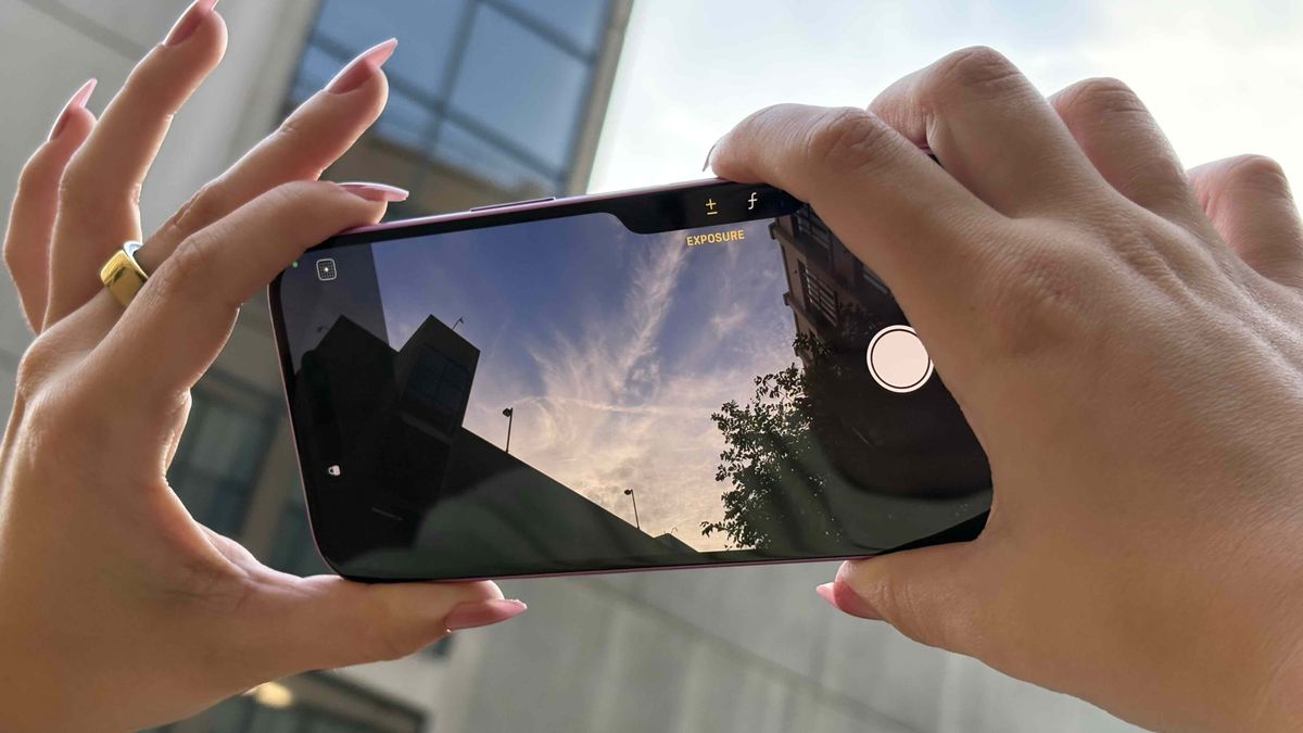
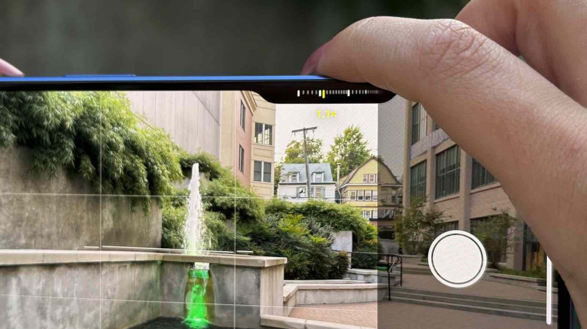
Manzari added: “What’s exciting about Camera Control is that it delivers a lot of improvements on the real fundamentals, so if you click it quickly launches into the camera, click again and it takes a photo, click and hold and it will take a video. All of this is without you having to readjust your grip or make any changes, it’s really just the fastest experience we’ve ever had.”
He also noted that the Camera Control is a technological first for Apple: “This is a combination of a force sensor and a capacitive sensor on this mechanical button, which is an Apple first – we’ve never really done that before, but it unlocks all these new experiences.”
Dinh added: “You are physically moving the button for the half-press, and we use that force sensor underneath to detect that tiny micron-scale movement, send a signal over to the Taptic engine, and really give you that haptic feedback.”
He also said that the Camera Control was designed with the “best materials”, for durability and aesthetics: “you have sapphire, you have stainless steel trim, and on the iPhone 16 you have aluminum all around it – all of those things have to be color matched.”
Dinh continued: “The amazing thing about the button is that it is flush. We’re hoping that the phone feels very much like your phone today in how you grip it and handle it, but we’ve added a little chamfer in there to give that really lovely half-press and full-press experience.”
Family-focused functionality

In usual Apple style, the pair were sure to link the Camera Control – and iPhone more generally – to real-world and family-focused experiences.
Manzari said: “When my daughter […] was little, I was using a lot more traditional camera equipment back then. And over the years it’s really shifted to iPhone […] It’s just much easier to hang out with your kids when you’re not bringing a lot of equipment with you.”
He added that the “precise, but also playful” tools included in the iPhone should be as useful to a small child as they are to a professional photographer.
Dinh said: “I have two little kids, a two-and-a-half-year-old and a six-year-old, and they both do the funniest stuff, but having camera control be able to get you up and running and capture that video – I have videos that probably wouldn’t have been captured otherwise.
He continued: “When you ask someone to do something again it isn’t the same, so having that instantaneous capture has been amazing.”
The full 27-minute episode of Design Tangents is available from Cool Hunting, and for the latest tech news and analysis be sure to also check out the TechRadar Podcast.
And, as ever, check out our iPhone coverage for the latest news, tips, and updates on Apple’s smartphone lineup.
Camera control: our verdict

So, is the Camera Control actually as “amazing” as Apple suggests? The people who designed it are hardly going to mention any downsides, so here’s a more balanced take.
Firstly, the Camera Control is genuinely exciting, and as the designers say, it’s the first time Apple has implemented this kind of technology – that’s a fact, not an opinion.
In our reviews of the iPhone 16 lineup, we found the Camera Control to be an “excellent addition to the iPhone”, adding a lot of utility in an intuitive way.
Similarly, we found Dinh’s claims about the Camera Control being made with premium materials to be accurate; as we note in our iPhone 16 review, the new button feels “super high-end, even on the affordable iPhone 16.”
That said, Camera Control isn’t immune from the staggered – well, messy – rollout of the iPhone 16’s full feature set. The most natural use for a button like this is a half-press focus and full-press shutter combo, but this isn’t available yet.
We also found the button to be awkwardly placed for vertical photo and video capture.
However, connecting with the ergonomics of traditional cameras, and thereby encouraging landscape photographs, fits with Apple’s more traditional stance on photography in the age of AI – Cupertino has sided firmly with the idea that photographs are images of what actually happened, rather than the more ambiguous “memory”-based approach adopted by Google.
Vertical video is an increasingly popular and important format, though, and as it is, the Camera Control is inconvenient to use this way; any ideas of tradition are somewhat undercut by upcoming AI cleanup tools, anyway.
Ultimately, the Camera Control is a great addition, and we’re thrilled to see Apple bring such an inventive and useful feature to the entire iPhone lineup – but in typical Apple style, it’s best used in a certain predetermined way.


